As I write this annual outlook, markets and pundits are still digesting the first Federal Reserve interest hike since 2006. In December 2015, Janet Yellen announced a 25 basis point increase in the federal funds rate, its policy benchmark rate.
Specifically, the federal funds rate is the interest rate at which banks lend the reserve balances they hold at the Fed to each other, usually overnight. An increase in a quarter of a percentage point is not exactly a huge jump, but it’s mind-blowing to try to compute the percentage increase from zero to any positive number. And most of us, including the Fed, take it as a signal of future interest rate increases1. These rate increases will be “data-dependent,” so nobody, even Janet Yellen, knows what they will be and when they will occur; but a typical forecast is a 25 basis point increase now to be followed by maybe 300 basis points or so over 2016 and 2017.
If you’re interested in real estate, you’re interested in interest rates. It would be difficult to find a REALTOR®, an economist or interested observers of any kind who wouldn’t posit some relationship between interest rates with housing and other real estate markets. It would also be pretty difficult to find someone who can specify, with solid evidence, precisely what that relationship is.
This article’s title is a takeoff on a well-known and well-written book by David Wessel, In Fed We Trust, which of course is itself a takeoff on the national motto. Turn over a dollar bill if you forgot. This article begins with introductory material about interest rates and looks at how they affect markets by focusing on national data. Later, we’ll see how Wisconsin’s housing markets have performed relative to national standards with a focus on prices. Finally we’ll wrap up with the overall outlook for the U.S. and Wisconsin economies.
In the Fed, do we trust?
Why did the Fed raise rates now? America’s central bank has a “dual mandate” — to maintain price stability and encourage full employment. In the long run, these two goals complement each other; though in the short run, sometimes actions that say they raise employment and wages have been inflationary, and actions that have restrained inflation cost jobs. But one of the most solid results of macroeconomic research indicates that these relationships — sometimes called “the short-run Phillips Curve” — are at best highly contextual. In some periods, the relationship looks pretty solid, but many experts think the current status of the relationship is a little fuzzy at best. This makes the Fed’s job harder in one sense, but may also give it room to maneuver in another.
Unemployment is down to 5 percent, which is great news on its own — but there’s more to the labor market than just this indicator. Labor force participation is down, and wages and other compensation are growing too slowly.
On the other hand, the Fed’s inflation target is 2 percent, and we’re not consistently hitting that number in the core Personal Consumption Expenditure deflator — the Fed’s preferred measure — or the Consumer Price Index that many of us check first. So if labor markets are still recovering, why raise rates now?
One reason for the rate increase is the time frame. What the Fed does today takes time — maybe 18 months — to work its way through the economy. Any Wisconsin hunter knows if you aim right at the duck, you’re going to shoot behind the duck. When the Fed raises rates today, it’s thinking about what’s likely to happen next year and a bit after. The rate increase signals that the Fed thinks things are looking up. And the Fed said if it’s wrong, we can forget about those other slow and steady increases. If unemployment creeps up, or if labor compensation weakens instead of strengthening, say goodbye to that increase of 300 basis points forecast mentioned on the previous page.
Verrry interest-ing
“Verrry interest-ing,” is from Arte Johnson in Rowan & Martin’s Laugh-In. Readers under 50: check YouTube.
Just what is an interest rate? While “the price of money” is one oft-quoted definition and maybe not a bad starting point, there is a lot baked into this seemingly simple concept!
The federal funds rate is an overnight, very short-term rate, while salient rates for mortgages are long-term rates. Even the most flexible adjustable-rate mortgages adjust quarterly — not daily; and the bellwether 30-year fixed-rate home mortgage is about as long term a rate issued in any modern economy. When thinking about long-term rates, consider them a sort of weighted average of today’s short-term rate, plus the market’s expectation of future short-term rates. Long-term rates should be higher when considering that future rates are going up; lenders then tack on a risk premium because after the fact, they cannot predict the fluctuation of future rates.
In the U.S., we usually quote so-called “nominal” interest rates; economists like to talk about “real” rates. For example, if you borrow or lend a dollar for a year in an inflationary environment, the lender would like the real purchasing power of that dollar back at year’s end plus some “real” interest payment for the foregone use of that dollar. The borrower will pay back in less-valuable future dollars, which they’re probably okay with paying. Economists therefore talk about “nominal” and “real” rates of interest — the difference being the expected rate of inflation, if looking forward, or experienced, if looking at historical data.
We’ve already noted two kinds of risk: rates will fluctuate over the life of the loan, and that this includes but is not limited to inflation. But lots of other risks, too, need to be priced in. In our world, we think a lot about these types of risk as well:
- Default risk: What happens if the borrower stops paying?
- Prepayment risk, for some home mortgages: What if the borrower current on a nice, fat mortgage payment prepays just at the worst time when rates have gone down, and the next best use for the money yields a lot less?
Economists write reams of papers about these issues, and Wall Street types make and lose fortunes over whether or not they understand these issues. Here, we’ll look at a few charts and make a few observations.
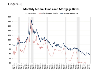
Figure 1 shows a rough correlation between the Fed’s short-term policy rate and long-term mortgage rates. Both rates rose rapidly during the inflationary 70s and early 80s, especially after Paul Volcker became the Fed chairman in 1979 and tightened policies to break those price increases. Volcker’s plan was necessary but at no small cost. Both rates declined after the 80s with a few pops up in the mid-90s just before the Tech Bubble burst a decade and a half ago.
When that bubble burst, the Fed became concerned about a weakening economy; its response was the (in)famous “Greenspan Put” circa 2001 that dropped the federal funds rate from 6 to below 2 in a matter of months; the corresponding fall in mortgage rates was roughly from 8 to 6. After 2004, the Fed began to pull up its policy rate, but mortgage rates hardly budged. When the Great Recession started, the Fed fought back with a plunge in the eponymous rate from a little under 6 to 0 in short order. Mortgage rates fell as the recession hit and continued to fall slowly to accompany the long but anemic recovery.
Aside from the cyclical stories, the big story is the long-run trend down in nominal mortgage rates since those 1980 peaks. The downward trend in nominal mortgage rates is no small part to the decline in inflation, and a subtle but important point in the decline in expectations about future inflation.
Don't panic
“Don’t panic” were the words “inscribed in large friendly letters” on the cover of The Hitchhiker’s Guide to the Galaxy.
If the past 30 years are any guide, we can expect increases in the federal funds rate to be accompanied by increases in mortgage rates — but as long as inflation remains under control, the sharp increase in mortgage rates seen in the 1980s are long gone. Whew!
Nevertheless, conventional wisdom has it that higher rates translate into lower prices and lower sales. What does the data tell us about how that’s worked in the past?
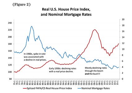
Figure 2 shows that reality is not so simple. In the 80s, the mortgage rate spike was associated with a decline in inflation-adjusted prices2. But in the early 90s, prices declined even as rates fell. Perhaps most inexplicably from a simple view, mortgage rates mostly declined through both the boom of the early 2000s and the post-2006 bust, and for that matter, they declined during the post-2012 climb-back.
Other data, not shown here, confirm similar patterns when examining the relationship between mortgage rates and sales over the last 40 years. Despite some conventional wisdom, it’s hard to make an argument that changes in interest rates are the major drivers of sales.
Many of us — myself included — sometimes fall into the trap of equating interest rates with broader financial conditions. Anyone involved in real estate over the past decade knows the real story: “mortgages are cheap if you can get one.” Broader financial conditions aren’t just affected by mortgage rates, which are loosely the “price” of taking out a loan; financial conditions are also affected by capital flows — the “quantity” of loans on an offer, along with the associated rules of the game for qualifying.
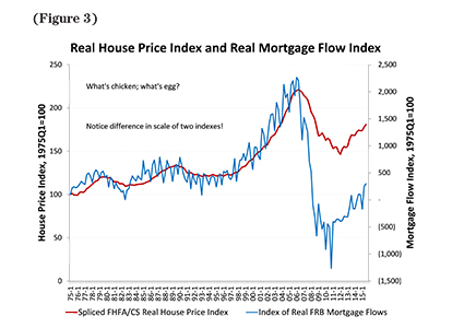
Figure 3 delves deeper into the capital flows. While Figure 3 revisits Figure 2, it replaces the financial “P” with a simple measure of financial “Q” and compares house prices to the flow of lending. Figure 3 shows that house prices and capital measures are more connected — in particular, house prices plummeted and flows of funds into mortgages fell off a cliff at about the same time in 2006. That gave rise to the renewed popularity of the famous 1980 Arnie Levin New Yorker cartoon, “Sure we have mortgage money. It’s just that you can’t have any.” A turnaround of both home prices and the mortgage flow took hold about three years ago, although net growth in mortgages is just creeping back to the levels of the pre-boom 90s.
This relationship between mortgage flows and housing prices brings up what economists call the “endogeneity” problem, and what normal people call the “which came first: the chicken or the egg?” problem3. Causality goes both ways: more capital strengthens housing and real estate markets, and stronger housing and real estate markets attract more capital.
As Figure 3 shows, both capital flows and house prices are currently climbing, and only during the past year or so have mortgage flows turned positive. After the 2006 housing market correction, the underwriting pendulum swung from pre-crash fogging the mirror to a post-crisis world of higher credit scores, lower loan-to-value and debt-to-income ratios, and perhaps most importantly the disappearance of some of the most egregious subprime and Alt-A mortgage designs. Many lenders are reluctant to lend on 1099 income, which eliminates a wide swath of potential borrowers. Some recent signs show the pendulum swinging back somewhat, though signals are weak and mixed. There’s a tick up from the respondents to the Fed’s Senior Loan Officer Opinion Survey on Bank Lending Practices, and the American Enterprise Institute’s Ed Pinto and Steve Oliner find evidence of recent loosening of typical debt-to-income ratios in FHA lending. But it’s too soon to call a substantial relaxation overall, and fortunately a return to the lax underwriting of the early 2000s is nearly inconceivable.
To clarify, I am not saying that interest rates don’t matter — I’m saying that other things matter more. Also, I’m not saying that national prices will continue to rise going forward as they did circa 2005. Research still underway at the Graaskamp Center is looking across the country, market by market, and so far shows that prices nationwide are starting to show a little froth — but nothing yet close to the bubbles of 2005 or 2006.
As in the run-up to the 2006 crash, the markets showing the most froth are mainly those where new housing development is difficult due to natural constraint and/or overly stringent land use and development regulations as well as markets that have significant demand pressure from rapid income and population growth. Some California markets are prime examples. Fortunately, Wisconsin markets are different.
Garrison Keillor was right — he just had the state wrong
Like Lake Wobegon’s children, most of Wisconsin’s housing markets are above average — if by above average, you mean below average in the risk of a large correction after our recent bounce back.
The most comprehensive data for Wisconsin comes from WRA county median sales prices for single-family homes. This information also shows the level of sales prices, while Case-Shiller and many other sources only show percentage changes.
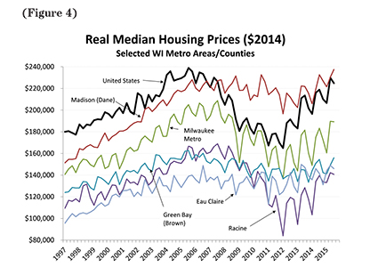
Figure 4 presents median sales prices for selected Wisconsin metro areas, adjusted for inflation using the GDP deflator. Milwaukee metro is the sales-weighted average of the county medians for Milwaukee, Ozaukee, Washington and Waukesha counties. The corresponding national median sales price from NAR is also presented as a benchmark.
Inflation-adjusted NAR sales prices are almost back to their 2005 level, which was an unsustainable mark in 2005. Are housing prices sitting on a more solid foundation today? On the negative side, recovery has been long but slow, and many indicators of wages and household incomes have been even slower to recover. On the plus side, better underwriting and stricter standards have left fewer recent purchasers at risk than a decade ago. Nationally, we’ve seen 30 million new residents but only 8 million households; a rough calculation suggests this is 3 million households and housing units short of postwar norms. If Millennials and others get back to forming households at the expected rate as Jim Wood discussed in the article, “Millennials Will Unlock Wisconsin’s Future” in the December 2015 issue of Wisconsin Real Estate Magazine, there is headroom to build more and sell more, while stabilizing price increases over the next few years to something closer to the rate of inflation.
The national data obviously include a large number of markets, some of which — like California, Florida and New York — saw much bigger booms and bigger busts than the national metric indicates. Generally, Wisconsin is on the other side of those trends. Figure 4 shows that many Wisconsin markets have lower price levels than the national average and mirrored the boom and bust of the 2000s — but on a smaller scale. Madison and Dane County had some of the boom and little of the bust; and Wisconsin’s median sales price now slightly exceeds the nation after years of lagging behind.
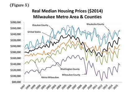
Metro Milwaukee is about 30 percent of the state and is worth a careful look. Figure 5 highlights the differences between Milwaukee County, which is dominated by the city, and suburban Milwaukee, especially Ozaukee and Waukesha counties. Suburban Milwaukee saw a run-up in real prices during the boom but little bust. Milwaukee County had a much lower level of prices as well as a more pronounced boom and bust pattern, indicating that we have a lot of work to do to bring the economy of our largest city up to its peers.
Wrapping up
Eight years into a slow but long recovery, and almost a decade since the last such move, the Fed has raised interest rates. The December 2015 basis point increase is a stalking horse for future increases. If the Fed is right and the economy continues to strengthen, we should expect future increases in short-run rates that eventually filter into higher mortgage rates — but with a healthier economy and the offset of stronger demand.
Reviews of metropolitan house prices suggest some parts of the U.S. housing market are getting a little frothy; fortunately, most Wisconsin markets are showing just a little of the crema that we Italians love on our espresso. More prosaically, most Wisconsin markets are less constrained in supply and subject to less demand pressure, placing Wisconsin among the less-risky markets. But across most markets, including some of our own, a little price stability at this point would be a good thing for the long-run health of our industry.
Overall, I welcome the Fed’s move, in no small part as a signal that recovery is gathering steam. There are always risks, of course, and not all are from the Fed. Geopolitical risks are always lurking, both abroad and close to home. While the 2016 election has yet to bring much serious discussion of the economy to the fore, I take some heart from the recent budget and other legislation passed with — be still my heart — bipartisan cooperation.
For several years, I’ve been in the camp that we’re not trapped in a low level of “new normal” growth below our long-run average of 2 percent real per capita GDP growth, along with all that brings to labor and real estate markets. I’ve argued that deleveraging from the financial crisis was going to take more time than recovery from a “garden variety” recession. Over the next year or two, we’ll learn whether I’ve been right. We’ve made progress in that deleveraging, and labor markets are showing tentative signs of a return to normalcy. The Fed seems to agree. I see a year of solid growth in the economy and expect to see real estate markets stabilize, rather than heat up, with more construction and Millennials forming more households. One of the best signs we’d see for a continued and sustainable recovery in housing markets is a return to broad-based wage and income growth across the income distribution.
Stephen Malpezzi is a professor at the James A. Graaskamp Center for Real Estate at the Wisconsin School of Business. Morris Davis, Andra Ghent, Richard Green and Jim Johannes gave constructive comments on the first draft but are not responsible for the views expressed by the author. Email the author at stephen.malpezzi@wisc.edu for a list of sources and additional reading.
1 When the Fed increases its policy guidance from 0 to 25 basis points (bps), it’s actually increasing from a zero-bounded range of 0 to 25 pbs, to a 25 bps higher range of 25 to 50 bps. As in the lower range in Figure 1, the effective federal funds rate has been close enough to 0 to loosely call it that. If you took my January 2015 reading recommendation and read UW math professor Jordan Ellenberg’s book How Not to be Wrong, you’re already tweeting, “Malpezzi should know that the percentage increase from 0 to 0.25 is mathematically undefined.” Good work, you caught me!
2 Figure 2 presents real housing prices, because in the long run, they are the best measure of the health of the housing market. Nominal mortgage rates are presented because borrowers are constrained in how much they can borrow when rates rise during inflationary times, as any mortgage lender and plenty of academic research confirms. None of the qualitative conclusions change when matching nominal mortgages to nominal prices, or real to real. The mortgage rates are from Freddie Mac for conforming 30-year fixed-rate mortgages. The housing price index is a national average from Case-Shiller for recent periods; early data, pre-Case-Shiller, is from the Federal Housing Finance Agency.
3 At least this one time, biology is simpler than economics. Any biologist or high school biology student with a smattering of genetics will confirm that the egg came first. The housing market-capital market endogeneity problem, though, remains unsolved.